Normale Ansicht

Media Masters

06. Juli 2026 um 20:08

Sequel suggestions: THEATER KIDS / BOARD GAME NAME REMEMBERER / OPERA SLUT

I’m not the biggest fan of trivia games. Especially those that require players to know a specific answer, and a hundred times those that sporadically stuff me into a locker with an unexpected sports question. “Who soiled his pants while stealing two consecutive homers during the 1914 Cinnamon Bakeaway summer camp?” the question will ask. “Nobody could possibly know that,” I begin, only for my father to scream “Mickey ‘The Dugout Dog’ O’Queefe!” for ten thousand points.

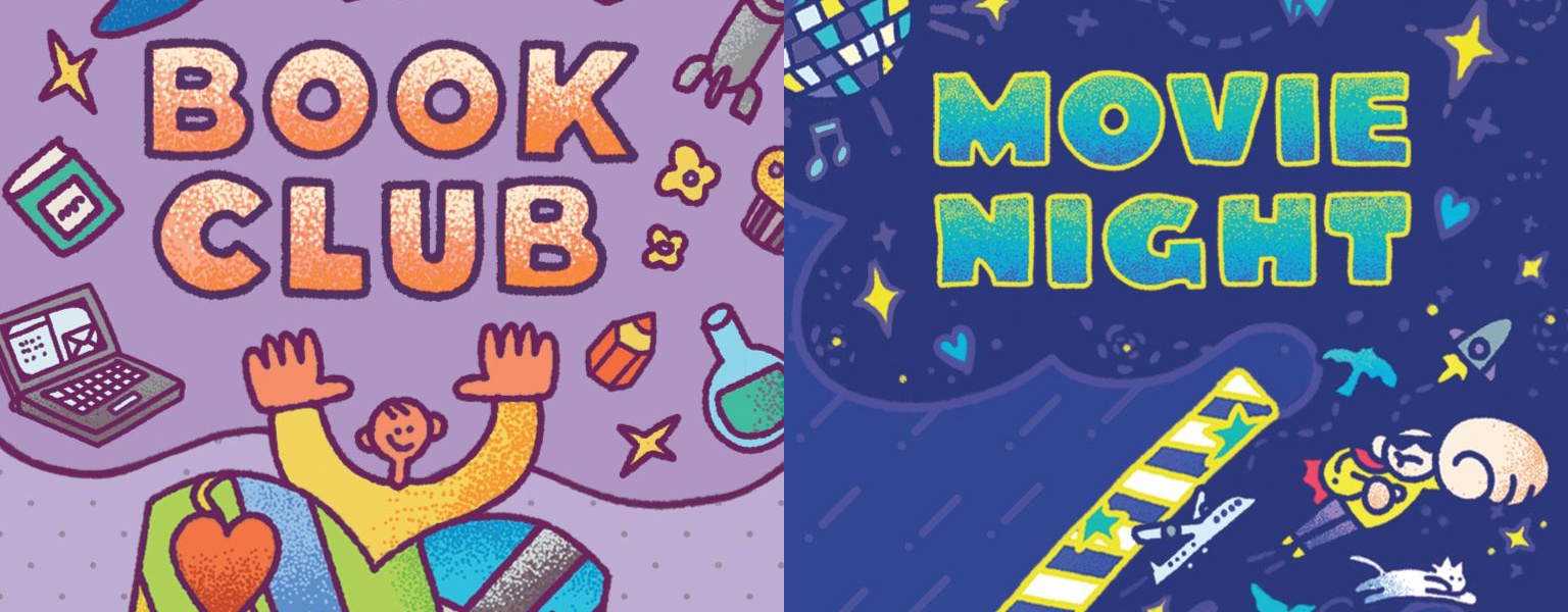
Book Club and Movie Night are teensy-tiny trivia games by Peter Hayward. Each session lasts five minutes, sometimes a run of cards will produce an impossible question, and they’re titles that will prompt the most obnoxious person in your gaming group to insist they’re activities rather than games. For all that, they’re the rarest of beasts: trivia games that put creativity and lateral thinking on the same footing as raw factoid retrieval.

The Sun Also Rises! < me trying to show off but failing completely

Name a book!

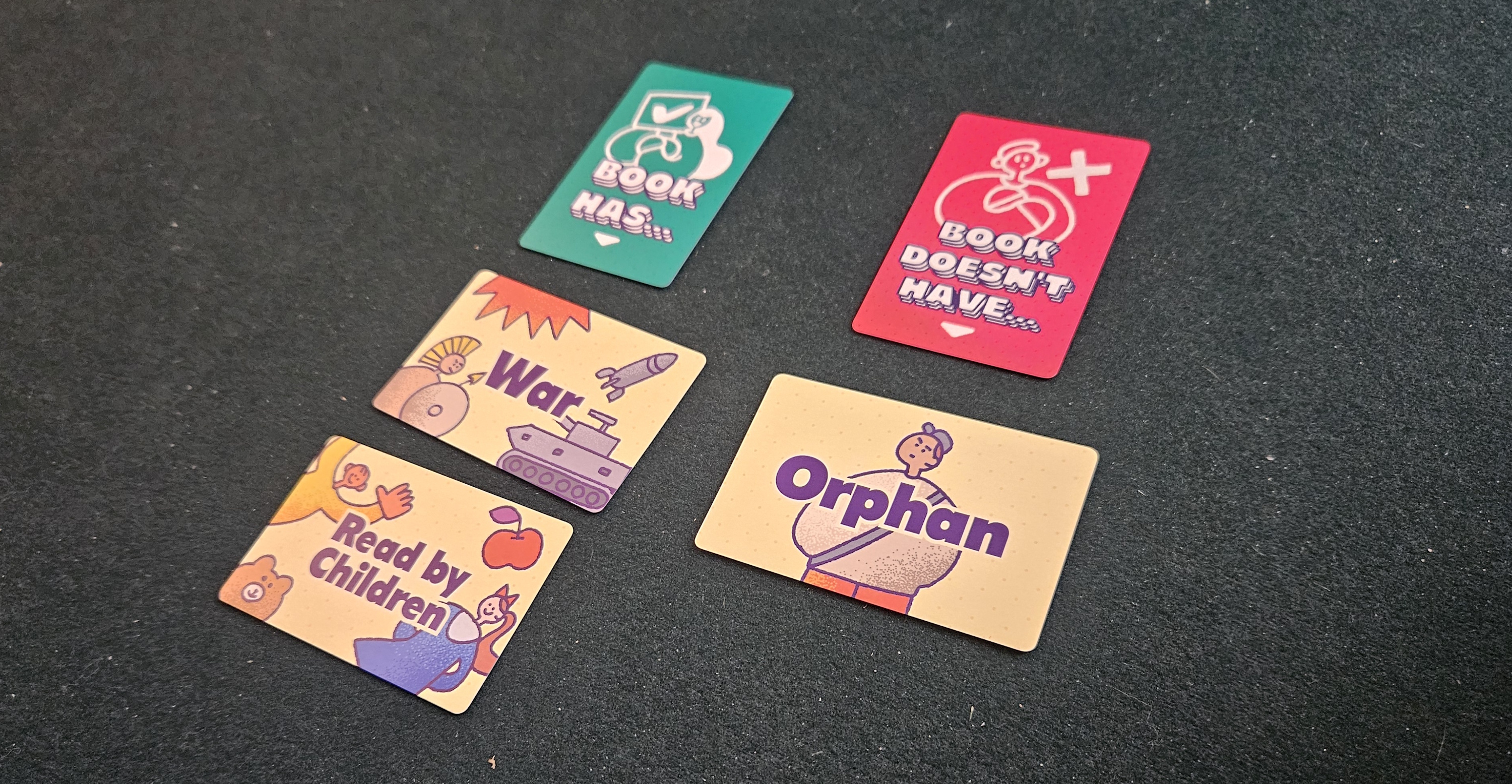
Rather than walk through the rules, let’s open with a demonstration. Movies. We’re guessing movies. So we draw a card. It says “punching.” What’s a movie that includes punching?

Rocky. Sure. Plenty of punching.

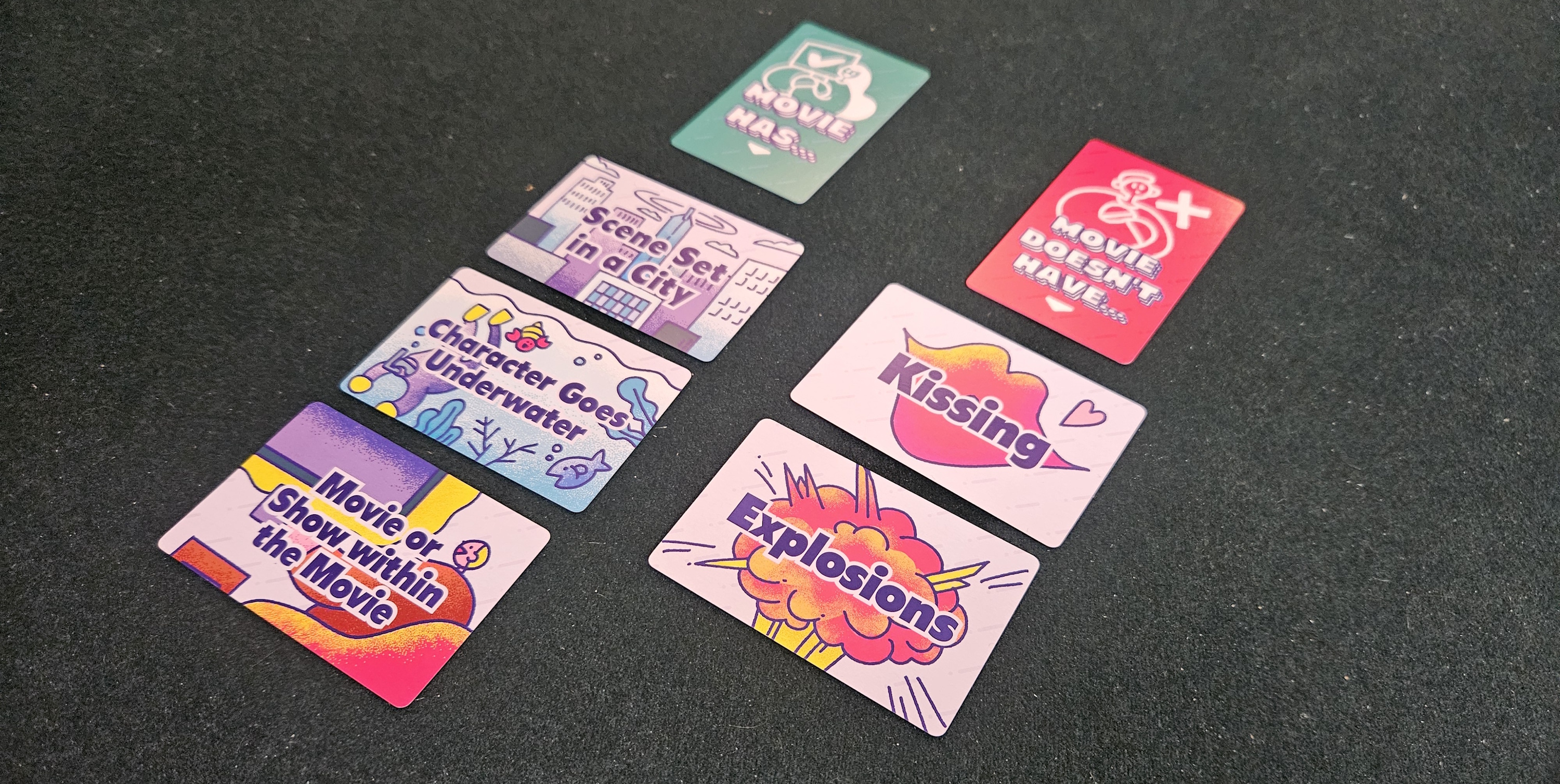
Now we draw another card. “Scene set in a city,” it reads.

At this point, we need to take stock. Does Rocky have a scene set in a city? Well, yeah. The whole thing. Philadelphia. There’s a statue. The city even renamed the steps.

So we take that card, “Scene set in a city,” and we move it into the “Movie Doesn’t Have” column. Now we need to come up with a movie that does have punching but doesn’t have any scenes in a city.

Knockaround Guys!” shouts my friend who always remembers weird movies like Knockaround Guys. That sounds about right. We spend a minute debating whether there’s a city scene near the beginning, but none of us can remember because Knockaround Guys came out in 2001 and it wasn’t a good movie to begin with, apart from that one scene where Vin Diesel really works over that redneck. Eventually we decide that, fine, Knockaround Guys works.

Another card. “Character goes underwater.” Uh oh. Pretty sure nobody goes underwater in Knockaround Guys. (Although maybe. We can’t remember. Knockaround Guys came out in 2001 and none of us saw it more than once. Nobody did.)

So what’s a rural punching movie where somebody goes underwater? Sinners. Of course. Props to Geoff with the contemporary cut.

Fourth card. “Celebration or holiday.” Now the group starts to fracture. Because while Sinners isn’t a holiday movie, it can be argued that the juke joint is a celebration of freedom, and that one scene is a celebration of African heritage, and now we’re debating what “celebration” means in the context of “celebration or holiday.” It matters. Because if we decide that Sinners includes a celebration, our next movie can’t have a celebration, which is a lot easier than naming a rural punching underwater holiday movie.

Phantom Menace, somebody offers, making assumptions about how we’ll rule on the celebration thing, only to be roundly denounced by all the other nerds.

Uncut Gems, my pedantic friend says, which is always a treat. He says it counts for “underwater character” because Adam Sandler is underwater to loan sharks, which is pretty funny and we’re considering it, but then we remember that the whole thing is obviously set in a city. We’d kinda forgotten about that card.

Finding Dory, says the person with kids. Apparently the octopus punches something, and while the movie is basically set in Monterey, there’s some wiggle room whether the fictional version of the Monterey Bay Aquarium should be considered a city or a greater unincorporated beachfront region. Also, since we still haven’t settled the “celebration” issue, this would retroactively put that card in the negative column.

The timer goes off. That’s five minutes.

Constantine II!

Name a movie!

Hopefully this demonstration has been helpful. Here are my takeaways.

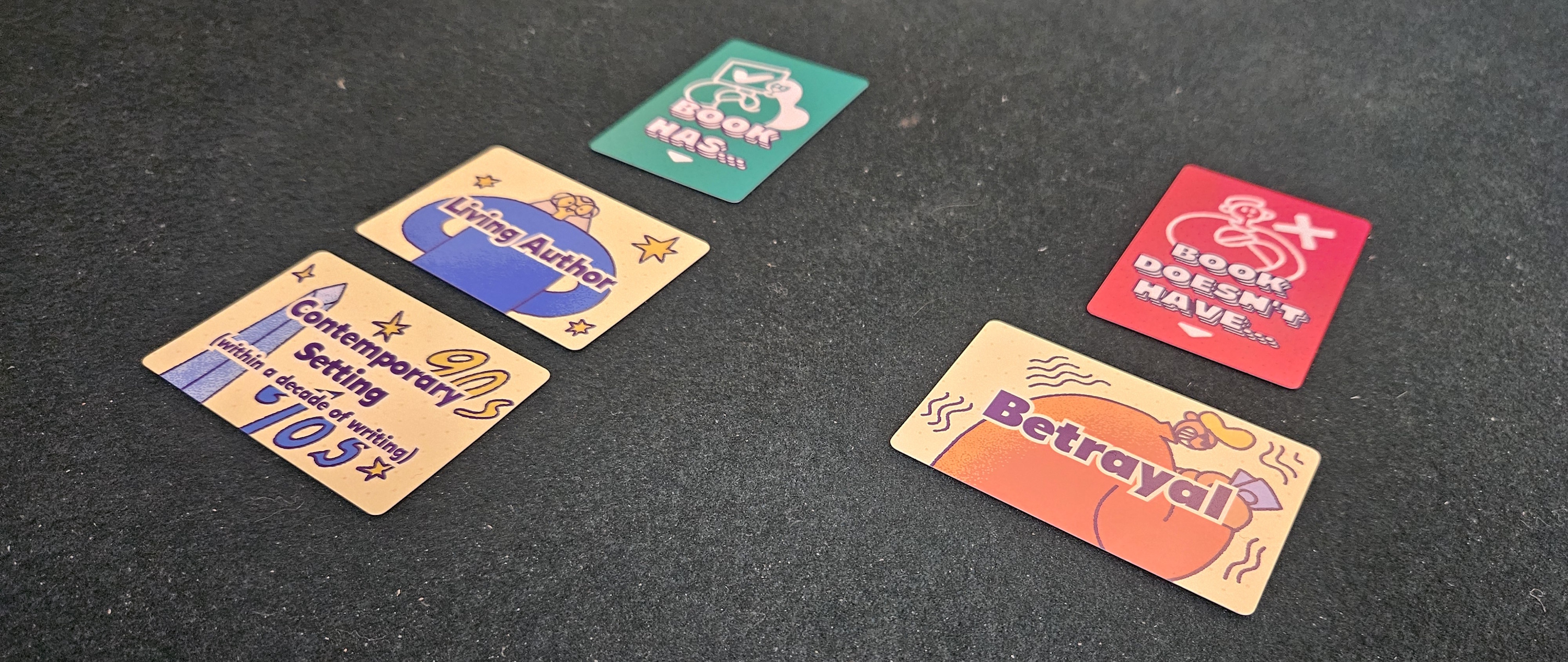
Perhaps foremost, this is a pedantic sort of game, one where every definition means what it means right until the moment when it behooves someone to argue that it doesn’t. “One-word title.” Hyphenated or not? “Adaptation.” Isn’t almost everything in Hollywood an adaptation? “Break-up.” Does that include friendships? “Snow.” You know somebody’s going to insist that cocaine counts. Personally, I think we all know what “snow” means. But then I propose a movie in Antarctica and now we’re debating whether pack ice really qualifies as snow. Fair enough. The good news is that it’s cooperative, so players don’t often come to loggerheads. You draw a card, squabble over its meaning a bit, and then move onto the next thing.

For all that, the experience it offers is often rather uneven. Sometimes you’ll hit upon a run of cards that’s too easy, and by extension too boring. In the next session you’ll be asked to only name movies with a stand-up comedian in a lead role. Or a book in epistolary form. Or to exclude media with “and” or “the” in the title. My least favorite? Only picking books whose author has an initial in their name. Hope you want to hear a lot of Christian fantasy author suggestions.

Books are harder than movies. Not only because it’s easier to watch a movie than read a book, so most people’s pool of options will be substantially deeper, but also thank the visual nature of the medium. Whether a movie includes a cat is easy enough to answer, even if it strains our gray matter. Recalling whether a book refers to a named character’s death is… well, it’s harder to conjure. At least for me.

For the most part, these textures are compelling, but it would be inaccurate to pretend they don’t sometimes lead to frustration. Riffing on movies is a delight. The same goes for books. But suddenly stretching to recall books-within-books when you’re four cards deep… well, it depends. Everything in Movie Night / Book Club depends.

There’s also a part of me that balks at the games’ size. These are slight things, roughly the size of a deck of playing cards, but at 40 and 34 cards for books and movies respectively, their variety is thinner than I would have preferred. And, look, their real value is in how those cards combine with one another. Even with the same three or four cards, their order can matter, and the appearance of even one other card can make a huge difference. But it’s disappointing all the same to draw a duplicate after only a few sessions.

The Sun Also Rises!

Name a book!

All told, then, Movie Night and Book Club are mixed bags. They’re snack-sized games, good for filling a few minutes, nice as stocking stuffers, but also not especially ambitious or groundbreaking. I hate to say it, but just this once: the absence of a “sports” card from Movie Night might be one of the most telling indications that this party game isn’t quite up to snuff.


Complimentary copies of Book Club and Movie Night were provided by the publisher.

(If what I’m doing at Space-Biff! is valuable to you in some way, please consider dropping by my Patreon campaign or Ko-fi. Right now, supporters can read the next installment in my series Talking About Games, this time tackling the topic of what makes a good list! Naturally, the piece includes a list.)

Crowdfunding Campaigns of the Week – 7/6/26

06. Juli 2026 um 15:42
Crowdfunding Campaigns of the WeekWelcome to this week’s batch of crowdfunding campaigns. We have a variety of offerings here, so we hope you will find something that catches your eye. Also, if you want to chat with the BGQ team, join our Discord Server where we talk about games, movies, sports, and other fun stuff. Check it out and […]

Source

Elevating Wingspan Pocket: PPC Product Design Playtests

06. Juli 2026 um 15:01

Historically, we put our games through a gauntlet of local playtesting, development, blind playtesting, data analysis, copyediting, and proofreading, plus a few pre-production copy playtests (typically by coworker Joe and then me and my St. Louis coworkers). Most of these playtests focus on making the game as fun, functional, balanced, and intuitive as possible.

But over the last year or so, we’ve added two enhancements to this process: One, we often ask Panda to make a pre-PPC copy as soon as possible after the proofs are approved. This looks like a real copy of the game, or at least what the game could be. Two, when we get to the real PPC stage, we make 4 PPCs instead of 1, and each of them is reviewed and playtested by multiple people. Both of these help us playtest the game as a product and to increase the chances of finding anything critical that was missed during the oversight process.

This brings me to Wingspan Pocket.

In some ways, Wingspan Pocket is one of our smallest games. It’s only around 6x4x2 inches, it only takes 30 minutes to play, and it asks each player to manage only 1 row of bird cards. Yet by another metric it is our biggest game, as there are 175,000 units in the first English print run, by far the most in our 14-year history.

With that much at stake, we really, really needed to get it right.

At our January company retreat in Phoenix (the first time all 8 of us have ever been in the same place), I proudly presented to my coworkers the pre-PPC of Wingspan Pocket, the product I had carefully crafted over the last year with the designer (Elizabeth Hargrave), playtesters, proofreaders, and the graphic designer.

I say this with love, appreciation, and humility: My coworkers proceeded to tear apart every aspect of the product. Not the game design–that was fine. Rather, it was the product design (a major component of my job) that fell short of their expectations.

The following result of 3 days of conversations, playtests, and pages of notes was a vastly superior product to the pre-PPC, especially in terms of onboarding. Accessibility is important in any game, but it’s even more important when a major goal of the game is to invite anyone and everyone into the world of Wingspan.

Many of the initial discussions focused on the box itself. The original box was an awkward shape, kind of like a smaller Oceania expansion box. With 130+ cards and 60 egg tokens, we knew the game wasn’t literally going to fit in anyone’s pocket, but the box needed to fit a smaller space on a shelf (whether that shelf is yours or at a game store).

After the company retreat I actually visited Barnes & Noble to look at their small-box games to see if there was a size that felt right, displayed well, and would fit the components of Wingspan Pocket. The end result is a box that is roughly the size of my hand.

The art for the front of the box had some debate, but with the name “pocket,” I felt strongly that we should keep the illustration of the pouch nest while making the word “Wingspan” as big as possible. (Of course, we had already debated other game names like Wingspan Go, Wingspan Swift” and Wingspan Nest, but we ruled them out due to connections to Pokemon, the Wingspan swift-start pack, and the Wingspan Nesting Box.)

The back of the box also went through a number of revisions to convey the simplicity of the game. We landed on a method used by many publishers for streamlined games: Explain the game with an image and 3 short phrases.

As we played the pre-PPC, we found that the reference card needed a lot of work. My initial goal was that someone could play the game from the reference card alone and only use the rulebook for a deeper dive, but there’s still a key difference between referencing key elements of the game and actually understanding the entire game.

In revising the reference card multiple times, we also revisited the rulebook itself, especially the first page. We truly wanted Wingspan Pocket to be accessible to everyone, including those who might be daunted by a short hobby game rulebook, so right on the front page we talk about what you need for your first game and showcase a rules video QR code.

While most of the discussions focused on the product design, a few gameplay-related elements came up as well. Originally, after someone played their 6th bird, players each took an extra turn (after each player had taken the same number of turns in the game). While this didn’t bother previous playtesters, we found at higher player counts that it really didn’t feel necessary and could turn a 30-minute game into a 45-minute game. So I talked to Elizabeth about removing the extra set of turns, and she approved the change.

Also, the goal cards in the game (which score 1 VP per egg on specific types of birds) were previously the default way of playing, and the rules suggested that players remove the goals for their first game. Instead, we switched to the goals being excluded by default, and for “advanced play” you can add them. Wingspanners accustomed to goal tiles and bonus cards should have no issues adding these cards.

I don’t think we’ve ever had a product that went under the microscope to the extent of Wingspan Pocket. We collectively put our hearts and minds into this game as if it is the only game we make, and I hope the final result brings joy to your table.

I’m sure we are far from the first publisher to playtest both a pre-PPC and multiple PPCs to improve the design of a product. But I’m sharing this because maybe you aren’t aware that these are options to explore–granted, very expensive options on a per-unit basis–as you seek to increase the chances of success of your product and to reduce errors.


Also read:

If you gain value from the 100 articles Jamey publishes on this blog each year, please consider championing this content! You can also listen to posts like this in the audio version of the blog.

Thunder Road: Ignition Game Review

Thunder Road: Ignition is Restoration Games’ attempt to streamline the production, ruleset, and gameplay of Thunder Road: Vendetta, itself an update of the 1980s Milton Bradley game Thunder Road, designed by Jim Keifer.

I’m on record here at Meeple Mountain as saying that Thunder Road: Vendetta is perfect in every single way save for one: the game runs about 30 minutes too long, and it does that pretty consistently regardless of player count. It’s gorgeous, it’s hilarious, it is a great design, and it has almost unlimited amounts of content in its deluxe Maximum Chrome version. Between that version, and the expansion Carnival of Chaos, there might not be a better “beer and pretzels” laugher in my collection.

When Thunder Road: Ignition arrived, I immediately set it up and waited for my nine-year-old to come home. He’s loved Thunder Road: Vendetta for a couple years now, and I was sure he would want to play Thunder Road: Ignition. He saw the cover artwork (once again brought to you by Marie Bergeron) and smiled that big smile. He was home. Then he asked a simple question, which I think defines the break point of where we landed on Thunder Road: Ignition.

“Where are the choppers?”

Son, There…

The post Thunder Road: Ignition Game Review appeared first on Meeple Mountain.

Interview with Matt White Designer of Spearhead: Hell on Wheels – Tank Battles in Normandy Print and Play Currently on Kickstarter

Von: Grant
06. Juli 2026 um 14:00

Over the past several years, we have done interviews with Matt White, publicized his games and played a few of them as well and he always has something cooking. Recently, I came across his newest offering on Kickstarter called Spearhead: Hell on Wheels – Tank Battles in Normandy. This game is a solitaire or 2-player print and play tactical game that allows players to take command of US tanks in German occupied France. I reached out to Matt and as always he was more than willing to share on the design.

If you are interested in Spearhead: Hell on Wheels – Tank Battles in Normandy, you can back the project on the Kickstarter page at the following link: https://www.kickstarter.com/projects/mattwhite-wargames/spearhead-hell-on-wheels-tank-battles-in-normandy

Grant: What is your new project on Kickstarter called Spearhead: Hell on Wheels?

Matt: This is a brand new solitaire and co-op World War II print and play tactical wargame. In this game you are in command of a group of 3 US tanks in brutal and intense tank combat in enemy-occupied territory. 

The players must lead their tanks, through unforgiving terrain, finding and then engaging the enemy in fierce fire fights. They must defeat any encountered enemy tanks and forces, whilst meeting the objectives as they move across the map. 

Grant: What was your inspiration for the name? What do you want it to convey about the design?

Matt: My biggest inspiration was reading accounts from various US armored units. Keeping your tank crews alive and positioning your tanks whilst dealing with unexpected enemy positions is key to survival and success and truly seemed to be “Hell on Wheels”. 

Grant: What about the battles during Normandy inspired you to make this game?

Matt: Basically I wanted to focus on and show the difficulties with the survivability of the armored crews and their vehicles during the D-Day invasion and the days after as the Allies broke out into France. That was the biggest point I wanted to make. 

An American M10 Tank Destroyer.

Grant: What research did you do on the subject?

Matt: As with all my games, in trying to get the historical aspects correct both in the mechanics of the game as well as the look and feel of the art, I basically try to do lots and lots of reading! I read as much as I can on the subject, from various authors and viewpoints, and when I am not spending time playing games or making them, I basically read! This knowledge is part of the inspiration for my games as I draw upon things that I have rad and then translate them to the page.

Grant: As a tactical level wargame, what are the most important areas of focus for the design?

Matt: The positioning of your tanks in relation to where the enemy could be, and not only the tank hull but also the turret. Keeping your tank crews alive and positioning your tanks whilst dealing with unexpected enemy positions is key to survival and success. This game is point-to-point based where you must place your tank orientation and can aim the turret separately. Being able to keep the front of the hull forward towards the enemy tanks whilst hopefully being able to fire on their flank is critical.

Grant: How does the game differ in its 2 modes including solitaire and cooperative?

Matt: In the game you are in command of a number of US tanks – these can be split between players if you wish. Its quite unlike a number of solitaire WW2 tank games where you are in command of one tank. In this game you have a number which makes it really suitable for co-op play.

Grant: I know the design is a Print and Play offering. Why do you feel this model is best suited for your designs?

Matt: I like making print and play games as it forces you, as the designer, to make every component count and making the most of the physical space on a sheet of paper. I find that challenge one of the most interesting parts of the creative process. I also like the print and play model because it is very affordable for all parties, both me and the players, and allows the game to be available to anyone at anytime and on their terms.

Grant: I see that the board has a point-to-point movement layout. Why was this your chosen method of conveying information about the battlefield?

Matt: As much as I love traditional hex based games (and continue to play a lot of them), I also like point-to-point too. I like the way you can combine not only line of sight but also information about the environment in the game.

Grant: What is the meaning of the different symbols that appear on the board?

Matt: Movement is from point-to-point and where you move from a Position Point (the rectangle points) to an Observation Point (the circle points) where you will test for observation and perform the majority of combat. If combat is successful then you will be able to move to the next position point. 

As you can see from the map there are multiple paths from Position Points to Observation Points and then onto other Position Points. Plus there are a variety of pros and cons to various paths to allow for a variety of terrain types and observation challenges. These paths are illustrated on the map in the shape of lines which are known as Movement & Observation Lines.

For each Movement & Observation Line there is a symbol at one end. The most common symbol is a black arrow, which denotes normal terrain and normal observation. There are other symbols which mean more difficult terrain or harder observation. These are:

Black Arrow – Normal Movement – Normal Observation

White Arrow – Normal Movement – Hard Observation

White Square – No Movement – Normal Observation

Black Circle – Difficult Movement – Normal Observation

White Circle – Difficult Movement – Hard Observation

Grant: What difficult decisions do players have to make in the game?

Matt: You will have to deal with enemies and you discover them but you don’t know where they are and so you must make some decisions based on information you do and don’t have. The player will also have several simultaneous objectives that must be obtained and will have to contend with both the German forces defending them that you know about and those that you do not.

“Lady luck” plays a part, as with any military operation, but your decisions and tactics are crucial, especially in how you position your tanks on the map when facing enemies as you cautiously roll through the environment.

A German Panther.

Grant: What dangers and threats meet the players on the battlefield?

Matt: There are a variety of dangers but not only the enemy forces as tank obstacles and mines can be a serious threat, combined with the environment itself.

Grant: What objectives does the player have to accomplish?

Matt: For each game session the objectives are randomly generated with Objective markers provided. All you have to do is safely get your tanks to those Objective markers, all the whilst dealing with the enemy!

Grant: How are hidden German units handled?

Matt: Every time you move your tanks you will need to check what they can observe and into which other points then can see. At this time you will roll on a couple of charts to see if you can see enemy units. However, just because you can’t see any doesn’t mean that they are not there.

Grant: What is the makeup of the Tank Cards? What information do they contain?

Matt: Using the Tank Cards you record the status of the major components of your tank such as the engine and tracks plus any gun jams. You also record the status of the various tank crew, all of which can have an impact in the game. Counters are provided to record all the status of both the tank and the crew.

Grant: What different types of tanks are included on both sides?

Matt: There are variety of tanks in the game with each tank having its own unique gameplay – for example the M10 tank destroyer has no hull machine gun (but does have a better anti-tank weapon). There are also Stuart M5A1 Tanks, StuG’s, Panzer IV’s, and many more.

Grant: How does combat work?

Matt: In the combat phase, you determine the order in which both your tanks and the enemy tanks fire. This is crucial to how the combat plays out as in real life WW2 tank combat, the results will favor the tank crew who can fire first on their target. 

You will roll a few dice, depending on your tank positioning and other factors, and retain the highest number. You can increase your number of rolled dice by certain criteria – the more dice you roll the better! For example, if your tank turret is facing the enemy, the terrain type, the health of both the tank and the crew and if the enemy have been observed all are major factors. The enemy tanks will be doing the same, so factors such as successful enemy observation in the previous phase are crucial!

Grant: What is the goal of the game? How is victory obtained?

Matt: Your goal is to reach your various objectives on the map, whilst trying to keep your tanks and crew alive.

For each game session the objectives are randomly generated with Objective markers provided. All you have to do is safely get your tanks to those Objective markers, all whilst dealing with the enemy!

Grant: What are you most pleased about with the design?

Matt: I am most pleased to be coming to the end of the design and getting it ready for people to play! Finishing or coming close to it, is the hardest part of the development. In terms of the actual game, I really enjoy being able to get a game that has depth and is engaging that can be printed on just a few sheets of paper. 

Grant: What kind of an experience does the game create?

Matt: I hope that the game creates a thoughtful representation of actual tank combat and how decisive it can be!

But that is not all. The game is modular and has several options included. As well as the map shown above, the game will also come complete with another map, additional counters and a rulebook which allows for you to create your own unique scenarios. 

This map has the same points but where you will roll on tables to determine the various Movement & Observation Lines from each Position Point and Observation Point. There will be counters that you can place between the Position and Observation Points as an aid. You will be using various charts and tables to procedurally generate your map as you play, determining those gameplay elements as you progress. This type of game session will present you with a new challenge as you really have to deal with more unknown elements as you progress your tanks across the map.

Grant: What other designs are you currently working on?

Matt: I have a few games I am working on – currently working on something involving WW2 Mosquito aircraft! 

For a YouTube video overview of the game, please check out Matt’s overview video here:

Thanks to Matt for his time in answering our questions and for his great little print and play games. I love it when one of these new games is brought to light as I get to oodle over the art and see what new things he has created!

If you are interested in Spearhead: Hell on Wheels – Tank Battles in Normandy, you can back the project on the Kickstarter page at the following link: https://www.kickstarter.com/projects/mattwhite-wargames/spearhead-hell-on-wheels-tank-battles-in-normandy

-Grant

Designer pair launch ColorSym, giving publishers a free tool for colourblind-friendly board game creation

06. Juli 2026 um 13:29

A pair of tabletop game designers have launched a free, open-source colour identification system they hope could become a common accessibility standard across the board game industry.

Colour blindness affects about 1 in every 12 men, and around 1 in 200 women – roughly 300 million people worldwide – and while some board game publishers have made vigorous efforts to make their designs accessible for colour blind players, many games released each year contain challenging colour combinations.

ColorSym began as a solution created by Chris Eastridge for his design Parks & Potions, which centres on combining colours to brew potions.

Parks & Potions designer Chris Eastridge

Eastbridge told BoardGameWire, “My first attempt at adding a meaningful colorblind solution to Parks & Potions put me up against a paywall. It bothered me so much that I was determined to make a system that others could adopt, free of charge, forever.

“We want designers to think, ‘This would make my game more accessible’, and be able to use it immediately. No paperwork, no fees, no asking permission. The easier it is to adopt, the more people it can help.”

Eastbridge created an initial symbol system for ColorSym before collaborating with fellow designer Luis Francisco, the owner of Brazilian board game publisher Grok Games and co-founder of tabletop design project management platform Boardssey, to expand it into a standalone open standard.

The system assigns each colour a simple symbol which can be used alongside colours, allowing players with colour vision deficiency to distinguish components without relying on colour alone.

But unlike bespoke icon systems created by publishers for individual games, Francisco and Eastridge hope they have created a universal visual language that players can learn once and recognise across multiple titles.

The pair have released the symbols under a Creative Commons licence and the accompanying font under the SIL Open Font License, allowing publishers to adopt the system commercially without licensing fees or seeking permission.

“I don’t think any publisher wants to create a game that excludes players,” Francisco told BoardGameWire. “The problem is that there hasn’t been a free, shared standard.

“Most publishers who want to solve this end up creating their own dual-coding system, which means players have to learn a new visual language with every game.

“The other big challenge is orientation. In board games, players see components from every angle around the table. A symbol can’t mean blue from one side and red from another.

Grok Games owner and Boardssey co-founder Luis Francisco

“That’s why the omnidirectional nature of ColorSym became such a fundamental part of the project.”

The pair cited multiple ” great examples” of dual coding across the industry, including Mattel adding patterns, symbols, and even tactile clues to some of its games, and Flatout Games soing “an excellent job with continuity of their color-specific components as seen with their Calico line”.

Eastbridge said, “Most solutions for color blindness can be accomplished through using associated iconography. Things like a flame symbol for red, water drop for blue, and so on.

“Where ColorSym comes in is where color has meaning. I think, for those publishers who are looking for a solution to color specific symbology, ColorSym will bridge that gap where unnecessary theming clouds the intent.”

Eastridge said the response to ColorSym from publishers had already been “incredibly positive”, adding that Steelwing Games – the new publisher from industry veteran Scott Morris – had expressed interest in implementing the system in a future release.

And the pair hope board games will be only the beginning.

Francisco said, “One of the very first messages we received after launching ColorSym came from a colorblind person who said ‘I wish these symbols were on my shirts so I could coordinate my clothes more easily’.

“That really stuck with me. Board games are where ColorSym was born, but if it ends up helping people in everyday life too, that would be an amazing outcome.”

Eastridge added, “I feel the same way. We built it for the board game community because that’s where we live, but there’s nothing limiting it to tabletop.

“If someone starts using ColorSym in education, apps, public spaces, or clothing labels, that would be incredible. The more familiar the symbols become, the more useful they become for everyone.”

Downloads, a live specimen, and full documentation are available now at colorsym.com, while the complete source files are available on GitHub.

The post Designer pair launch ColorSym, giving publishers a free tool for colourblind-friendly board game creation first appeared on .

Hot Streak, Speakeasy, Fate of the Fellowship among this year’s Origins Awards winners

06. Juli 2026 um 12:22

Editor’s note: GAMA is one of the sponsors of the BoardGameWire newsletter

The Origins Awards, one of tabletop gaming’s longest-running prizes voted on by industry professionals, has crowned its latest group of winners after whittling them down from 120 nominees.

Jon Perry’s Hot Streak continues to live up to its name as far as award wins go, adding party game of the year to a pair of Golden Geek Award wins, casual game of the year in the American Tabletop Awards, and a ‘recommended’ accolade in the Spiel des Jahres.

Matt Leacock’s The Lord of the Rings: Fate of the Fellowship, built on the DNA of his global hit Pandemic, doubled down on its own Golden Geek Award wins by being named cooperative/solo Game of the Year, while Vital Lacerda’s design Speakeasy took the Heavy Strategy Game of the Year award.

Railroad Tiles, designed by Hjalmar Hach and Lorenzo Silva, took Gateway Game of the Year, while Will Thompson’s Winter Rabbit was named Light Strategy Game of the Year at the award ceremony, which took place at Origins Game Fair last month.

Railroad Tiles, designed by Hjalmar Hach and Lorenzo Silva

The awards also recognised Matt Brown and Zara Reid’s conservation-themed board game Kavango with a Sustainability Award, which aim to celebrate games with thoughtful production and publishers which “have taken strides towards sustainable manufacturing to reduce the impact on the natural environment”.

Outside the board game categories, James Parks and Ben Costa’s Land of Eem won Roleplaying Game of the Year, while in the trading card and collectible game categories Riftbound: Proving Grounds won Fixed Constructible Game of the Year, while the Gudnak: Expansion Bundle took the Randomized Constructible Game award.

Games Workshop dominated the miniatures awards, winning both Miniatures Game of the Year with Blood Bowl: Third Season Edition and Miniature of the Year with Warhammer: Age of Sigmar model Festus The Leech Lord.

Festus The Leech Lord

Goblin Hobbies’ Stampin’ Plates claimed the Paint/Hobby Accessory award, while Luis Silva’s TCG design Shard Bugs claimed Fan Favorite Game of the Year, voted on by Origins attendees.

The awards, which are organised by non-profit trade organisation GAMA, came under fire earlier this year for failing to mention any of the games’ designers for the third year in a row.

GAMA made an effort to rectify that error with its announcement of the award winners, including not only the names of the designers but also the artists who worked on each title.

The Origins awards, which were first presented in 1975, have been in heavy flux over the past few years, going from 10 categories in 2019 to 24 in 2024 – with the make-up of those categories significantly shaken up from year to year.

GAMA briefly introduced categories in 2024 which represented its membership having expanded beyond just retailers, publishers and wholesalers – including recognition for artists, writers and media.

But those segments were quickly dropped again in 2025, with categories cut including Best Media Production, Best Game Related Writing and Best 2D Artwork – although the miniatures segment was expanded from two categories to three, covering games, the miniatures themselves, and paint and accessories.

Separate from the main slate of awards, the trade organisation also revealed its hall of fame entrants this year, awarded – like the Origins Awards – by its division the Academy of Adventure Gaming Arts and Design.

AAGAD describes itself as “a peer based network of gaming industry professionals whose mission is to promote innovation and excellence in design and production of games and game related materials”.

Individuals inducted into the hall of fame this year include Richard Borg, famous for his design of the Command and Colors system used by games including Memoir ’44, and Antoine Bauza, the creator of designs including 7 Wonders, Hanabi and Tokaido.

Magic: The Gathering, Pathfinder RPG and Dungeons & Dragons artist Wayne Reynolds was also inducted into the hall of fame.

Origins Awards 2026 – Full Results

Gateway Game of the Year
Railroad Tiles
Publisher: Horrible Guild
Designers: Hjalmar Hach and Lorenzo Silva
Artists: Francesco De Benedittis and Barla Tranquilli

Party Game of the Year
Hot Streak
Publisher: CMYK
Designer: Jon Perry
Artist: Cécile Gariépy

Light Strategy Game of the Year
Winter Rabbit
Publisher: Absurdist Productions
Designer: Will Thompson
Artists: Kindra Swafford and Jonni Ketcher

Heavy Strategy Game of the Year
Speakeasy
Publisher: Eagle-Gryphon Games
Designer: Vital Lacerda
Artist: Ian O’Toole

Cooperative/Solo Game of the Year
The Lord of the Rings: Fate of the Fellowship
Publisher: Z-Man Games
Designer: Matt Leacock
Artists: Jared Blando and Cory Godbey

Roleplaying Game of the Year
Land of Eem
Publisher: Exalted Funeral
Designed & Written by: James Parks and Ben Costa
Artists: Justin Gerard, Sean Kiernan, Anneliese Mak, Sam Mamei, Rosario Mendez and Rob Gatto

Roleplaying Game Supplement of the Year
Call of Cthulhu: The Sutra of Pale Leaves – Twin Suns Rising
Publisher: Chaosium
Designers/Authors: Yukihiro Terada, Jason Sheets, Damon Lang, and Andrew Logan Montgomery

Miniatures Game of the Year
Blood Bowl Third Season Edition
Publisher: Games Workshop

Miniature of the Year
Warhammer: Age of Sigmar – Festus, The Leech Lord
Publisher: Games Workshop

Paint/Hobby Accessory of the Year
Goblin Hobbies Stampin’ Plates
Producer: Goblin Hobbies
Designed by: Brent Amberger and Casey Alden

Fixed Constructible Game of the Year
Riftbound: Proving Grounds
Publisher: UVS Games & Riot Games
Designers: David Smith and Jon Moormann

Randomized Constructible Game of the Year
Gudnak: Expansion Bundle
Publisher: Chaotic Great Games
Designer: Tim O’Brien and Ian Oliver
Artist: Vittoria Pompolani

Fan Favorite Game of the Year
Shard Bugs
Publisher: Shard Bugs LLC
Designer: Luis Silva
Artists: Ray of Sand, Nelygibi, Julio E. Jácome Paz, María Ayuso, Alma Faustica, Pietro Desirò, Ninamarie, Steve Ozminkowski, Erick Mezart

The post Hot Streak, Speakeasy, Fate of the Fellowship among this year’s Origins Awards winners first appeared on .

Illustrator Avenue: Bartek Jędrzejewski, PHALANX

by Justin Bell

Welcome back to Illustrator Avenue! In this edition, I spoke with Bartek Jędrzejewski, who serves as the Art Director, Illustrator, and UI Designer at PHALANX, the publisher of wargame titles such as Purple Haze, Successors, and Keep 'Em Rolling: 1941—Race to the Rhine.

Bartek and I first met online before trading correspondence offline to build this interview. Enjoy! And if you like this series and/or are an illustrator or graphic designer, please reach out. I’d love to chat about future features in this series.


Justin Bell (JB): Hey there Bartek! Thanks for agreeing to be a part of this interview series. I see that you have tabletop artist credits that date all the way back to Dominant Species, released in 2010. Before tabletop, what were you doing prior to your time in the industry?

Bartek Jędrzejewski (BJ): Hi! First of all, thanks for having me—I’m really happy to be part of the series.

Regarding Dominant Species—that actually wasn’t my first project and it happened much later than 2010, which was the year when GMT initially released the game. We published the Polish version in 2023, while also giving it a complete visual redesign. Later we also published our new version for the French market and the sequel, Dominant Species: Marine, both in Polish and French.

As for my beginnings—they were pretty humble :). Drawing and creative endeavours were always important for me. I started as a freelancer around 2015—at first it was small gigs—some concept art, simple (and not very good) illustrations and random graphic design work. Since sometimes it was financially rough (who would have guessed, right?), I also took some graphic side jobs, such as ads, posters or a menu for a Vietnamese restaurant for example.

Honestly, I couldn't really afford to be picky back then. At the same time, I was constantly learning and practicing. Trying to improve my illustration skills and understanding of art, visual storytelling and design. As time passed, I got more commissions from the tabletop industry and also got in contact with PHALANX. At first we worked on a commission basis for a couple of projects, but in 2019 they invited me to join their team full-time. Fast forward to today and I'm still working with them:)

***

JB: Many of the titles you’ve supported look like historical wargames, so let’s start there. What periods of history intrigue you most? Based on where you live, are there any past conflicts that feature Poland in your work? Given the wide range of games you’ve illustrated over the years, I’m always excited to meet a history buff!

BJ: Yeah, I’ve always been interested in history, although I probably wouldn’t call myself a hardcore history buff. Funny enough, the deeper I got into working on historical games, the more interested I became in the actual subjects behind them.

I really believe that if you want to portray a culture or a historical period well, you need to spend time understanding it first. Thorough and deep research is a very vital part of any project, even if I’m “just” working on visuals for a board game. It helps in capturing the atmosphere of the era, avoiding clichés, and making more conscious artistic decisions. And to be honest history on its own can be just fascinating once you start digging into it.

Luckily, there are a lot of history enthusiasts on our team who are always ready to recommend books, references, or point me in the right direction. The same goes for many game designers I’ve worked with, especially in historical games, people are often incredibly passionate and knowledgeable. So far I have only positive experiences collaborating with them.

As for my favorite historical period—that changes constantly, also due to whatever project I’m currently working on. Lately I’ve been fascinated by Japanese history and culture. It actually started a few years ago when I picked up Gai-Jin by James Clavell (Shōgun). Later, when I got the opportunity to work on the game Sovereign: Shōgun which is set in feudal times In the Land of the Rising Sun, I started reading everything I could get my hands on: books, recommendations from friends, historical essays, documentaries. I kind of fell down the rabbit hole.

Of course, working for a publisher based in Poland, the country's rough history is also present in some of the games we have been working on. Titles like Coalitions, Coalitions: Raison d'Etat, or 1920: Nest of Eagles touch on particularly important and difficult moments from our perspective. There are also some very interesting projects that are cooking right now and reference Polish history (or an alternative version of it), but I'm afraid I can't tell more about it at the moment ;)

***

JB: What types of games do you like to play, outside of your work as an artist? Maybe more importantly, how often do you find the time to play games? What do your playgroups look like? And what is your all-time favorite title?

BJ: Lately, between family life and work, it's hard to squeeze in enough time to play as often as I would like to. But whenever I do get the chance, I usually gravitate toward games which revolve around player interactions. I prefer games where the tension and uncertainty comes from the unpredictability of other players' decisions, rather than from random dice rolls or lucky card draws. I always had a high regard for games that are easy to learn, but hard to master. The ones with elegant and simple mechanics that create depth naturally, instead of overwhelming players with a multitude of possibilities and a whole set of actions, where the player's task is only to calculate and find the optimal solution to score the most points. I rather appreciate systems that feel intuitive and purposeful, where mechanics are not only "holding" the game, but also help to build the story.

That being said, the kind of games I play depends heavily on who I’m playing with. When I'm with seasoned players playing some strategic and interactive titles I will enjoy fierce rivalry, skulduggery and backstabbing. At home, playing with my wife or kids we usually choose casual games, but that doesn't mean the sessions are less fun.

As for my all-time favourite, I don't think I have the one and only number one game yet - maybe it's still somewhere out there, waiting to be discovered (or designed). If I had to still choose my top games, then I would go with Dune: Imperium, Dominant Species: Marine or Root. For lighter titles, I would go with Dominion, Carcassonne or The Quest for El Dorado.

***

JB: Who are some of your favorite tabletop artists? How about your favorite graphic design and UI work in the industry? I love learning more about what work other artists admire from afar.

BJ: Uff, that's a tough one, since there are so many incredible artists in tabletop right now. In general the games are getting prettier and more visually ambitious each year and publishers, fighting for our attention, are serving us real feasts.

Lately, I've been mesmerized by The Old King's Crown—the worldbuilding, visual style, storytelling and pure draftsmanship is at an incredible level. I also love how cohesive the art with the mechanics is—the whole product tells a great and consistent story—I think it's one of the most visually striking games out there, if not THE most striking one.

In general I appreciate when illustrations, typography, UI, iconography, and overall art direction all feel like parts of the same world. When a game achieves that level of consistency and cohesion, it becomes more than just “good-looking”, it becomes immersive. There is a threshold at which you stop simply playing the game and start genuinely "experiencing" it. Visuals, UI and UX are key in achieving that, I think.

I also believe that good art direction follows the rule that it's better just to imply things that don't need to be explained. Nicely executed but generic and "obvious" illustration gets boring fast and honestly doesn't bring much of an essence to the game. For me if it doesn't serve a role in a whole product it doesn't belong there. The games that I find great in terms of its visuals are usually the ones willing to take creative risks and establish a strong visual identity of their own. Harmonies is a great recent example of that approach.

And while I admire the work of established artists like Ian O'Toole, Andrew Bosley or Vincent Dutrait (who doesn't, right?), I always try to look for inspirations in other areas of art and design. For example, when I was working on the UI for Coalitions (a diplomatic/war game set during Napoleonic Wars) I spent a lot of time studying architecture and Empire-style furniture designs from the era. There were whole rooms prepared for Napoleon with richly decorated tapestries, chairs, cushions, etc. and some of those beautiful designs lended itself to the final look of Coalitions. When I was working on HUANG, a game based in ancient China, I spent probably too much time scrolling through online collections of the British Museum or The Met. It was an important part of the process though and I found a lot of references while doing that.

***

JB: I’m always intrigued to learn more about when an artist is brought into the fold during a game’s development cycle. Based on your work at PHALANX, when do you typically get involved? And how many projects are you juggling at any one time? For example, I see that Coalitions has both a base game and a number of expansions.

BJ: That changes from project to project, but I usually get involved during the development stage, before open playtesting begins. Thanks to that I can witness the process of creating the mechanics and start to think about its visual representation. Getting early onboard is especially important if we want to work on the UX part of the game, because this is the part where the tasks and responsibilities of developer/author intersect with my field. Good UX and UI design is intertwined with the mechanics and shapes how intuitive the game feels to play. My role is usually to analyze the flow of information and figure out how visuals can support the player experience without overwhelming it.

But honestly every project is a bit special and has its own specifics. For example with Purple Haze, much of the interface solutions were made by the author, Bernard Grzybowski. My task was just to refine, beautify and update the design according to the developers' changes. On the other hand, I got to play Coalitions long before I started working on it. Also I was not the only illustrator involved in that project. I did the illustrations for the base game, but for the expansions we outsourced them to other artists. Part of my work was to find the right people, prepare briefs, give feedback and help them bring it to the finish line. That aspect of the job—collaborating with other artists and shaping a unified visual direction—is something that happened in a couple of other projects and I’ve really grown to enjoy it over the years.


JB: Let’s talk about an upcoming project that you are working on. Walk me through an image from the game; how did this go from concept to what it looks like in the game’s final production?

BJ: Sure! So this is a box cover I created for one of our upcoming titles.


The game's called Dust in the Wind and it's a spiritual successor to Purple Haze: a party-based, story-driven, RPG-like experience. Dust in the Wind is set in the Wild West, in the early 1870s and players take on the role of cowboys and cowgirls who will wander this land in search of fame and fortune.

Because the game is heavily narrative and draws inspiration from Western films, we wanted the cover to feel almost like a movie poster. Something that gives the gist of the atmosphere, story and characters from the plot and at the same time is eye-catching and visually striking. However, we didn’t want to blindly follow conventions and typical clichés, but rather create something that breaks away from the typical Western style imagery, something that can stand on its own.

The creative process usually starts with some rough sketches and composition ideas.


I thought about what kind of characters and situations I wanted to show, and then did simple comps. This is probably my favorite stage of the whole process, since it is basically experimenting, guessing, and quick-sketching. It's the time where every idea is welcomed, nothing is precious yet and I can jump between different ideas quickly. Basically it's a kind of controlled chaos.

Once I feel like I've explored enough paths, I refined and polished the strongest comps, and presented them to the rest of the team. Together we discussed what works best and chose the direction we wanted to follow.


(A note about these storyboard titles: Red West was just a working title for this game. Later we decided to change it to Dust in the Wind.) After that it's time to go back to my studio and start the last part of the process. For this project I decided I want to first draw the characters by hand. I started with pencil sketches and then moved to inking.


When it comes to drawing I feel more comfortable with traditional mediums—the feel of a moving pen on paper is unique and simply joyful (and art without fun doesn't count). I was not really worried about small mistakes or imperfections; I knew I could fix that later, when I bring everything into digital form. After doing that came the most time consuming process: coloring, rendering, detailing, and finalizing. At this stage I wasn’t making many compositional changes, since they are too time-costly. The earlier sketching phase was really where most of the major decisions were made. After many hours of scribbling, tweaking, overpainting and drinking coffee, the illustration is ready.


A big thanks to Bartek for spending some time answering my questions for this interview. Also, a big thanks to the team at PHALANX for giving me some time and space to work with Bartek on a discussion about an upcoming title. You can check out the complete PHALANX catalog at https://phalanx.co.uk/.

—--

Are you an illustrator and/or graphic designer involved in the creation of images and iconography for the tabletop space? Please reach out! I’m building up a repository of people interested in contributing to this series. Just message me here on BGG and we’ll get to work. Thanks for reading!

Lands of Evershade v1

06. Juli 2026 um 00:56

Icarus, how close is this to full brightness?

Get out of the sun with your Lands of Evershade rules and reference!

Awaken Realms have been creating story-driven adventure games for a while now, but they’ve gone almost full RPG with their newest game, Lands of Evershade. And considering the huge success of their campaign, this RPG/board game hybrid with modular adventures is just what the punters have been looking for.

Yes, the adventures are, as always, elaborate Choose Your Own Adventure branching paragraphs (is there any other way to control the rhythm of a story in RPG-like boardgames, I wonder?), but Awaken have reached a new a level of elegance here. Their games tend to be very rules-heavy, with an emphasis on following complex turn structures that can sometimes feel a bit like ticking off items on a spreadsheet (I’m looking at you ISS Vanguard). Which can work fine because they do demand a level of deep involvement and commitment unlike most casual games, and are often weighted towards playing solo as a result. But Lands of Evershade takes things to a smarter level by combining a simple skill check dice mechanic with detailed player-created characters, and then only layering on bits of complexity for the particular scenario set-piece your characters are involved in.

They’ve also hit that sweet spot, in my opinion, that makes the game something you want to keep taking off the shelf – it’s a campaign, but each full adventure demands a manageable commitment of time and is broken into bite-sized chunks of an evening’s play each. And the tactical combat system is just complex enough to be interesting, without getting bogged down in fiddly rules for things like line of sight, range, and too many special rules.

I’ve only completed the starter adventure, Into the Whitewell, and just started on the advanced adventure, but so far I’m really enjoying this relatively light and fun fantasy game, and I’m very much looking forward to continuing my adventures in this interesting world. The game definitely rests on the quality of its modular adventures, so here’s hoping the high bar set by the introductory one is maintained.

The rules are in the main easy to remember, but here’s my summary, along with a reference sheet that handily replaces the multiple reference cards in the game with one small sheet. The summary is of course also in my app, Tabletop Codex).

❌